
IPHONE DESIGN REFRESH
MAR 2013
When I redesigned the iPad app, we also had to refresh the iPhone app and clean up screens that would be used universally. After 10 months of effort, the new apps were available in the app store with a 4.5 star rating and great review View it in the App Store.
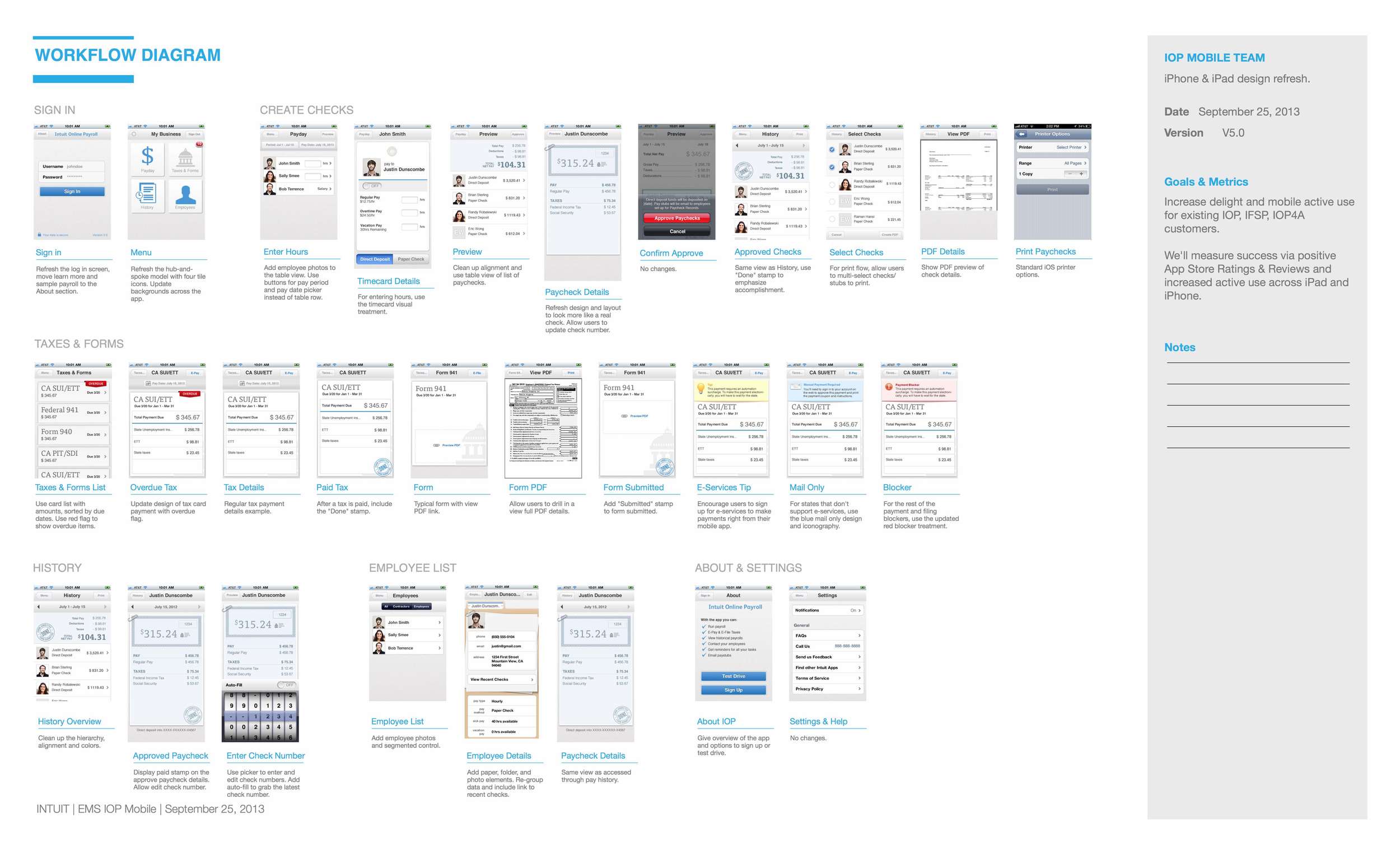
Workflow diagram
In parallel with the iPad design effort, I documented all of the iPhone app screens and noted where we could leverage the same design and ultimately the same view controllers. In collaboration with dev, we worked through an approach that would drive consistency across the apps while still allowing for layout flexibility on iPad that would leverage the extra real estate and give customers the delighter of on-the-fly paycheck calculations!
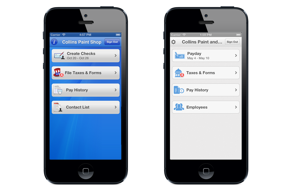
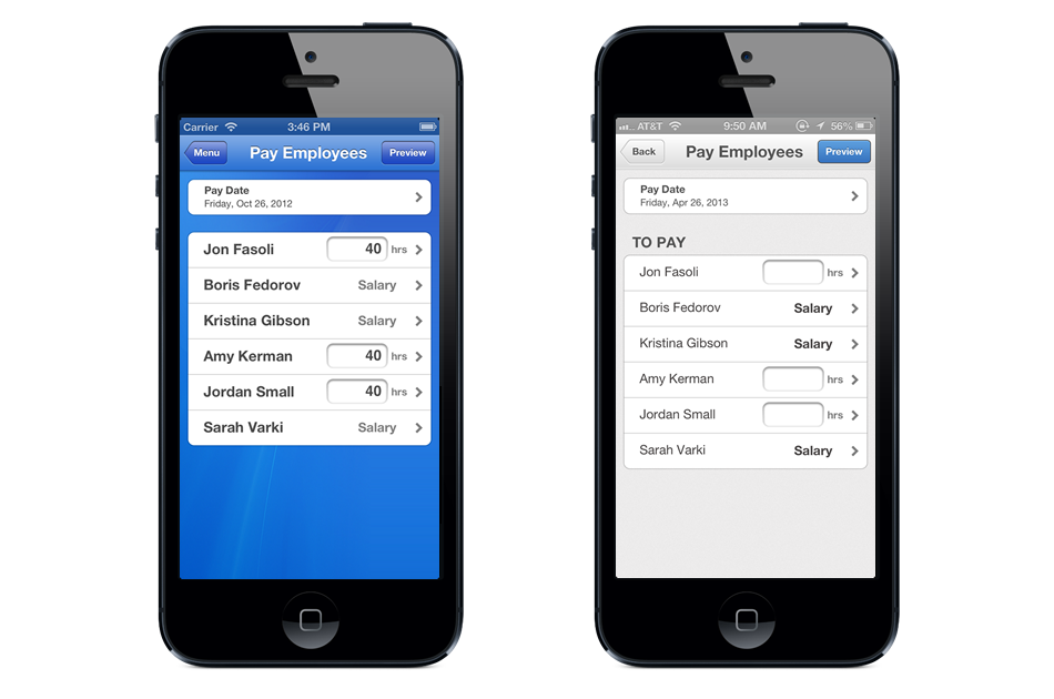
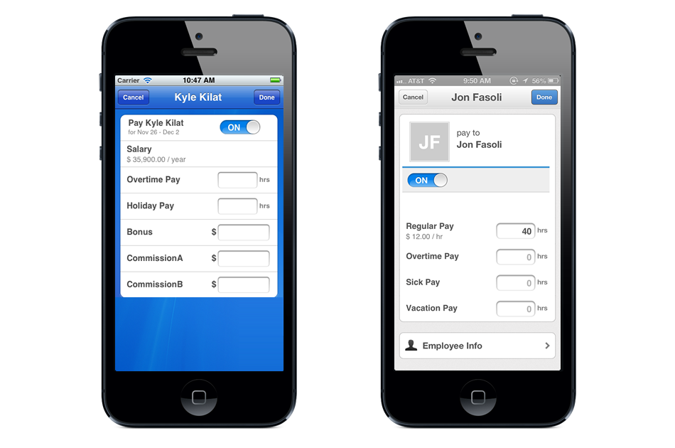
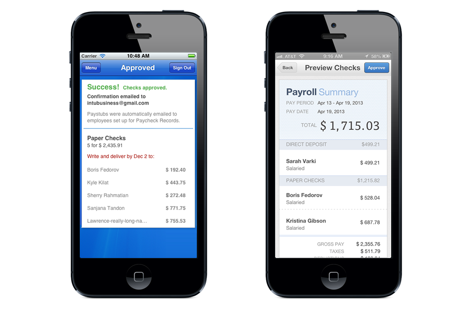
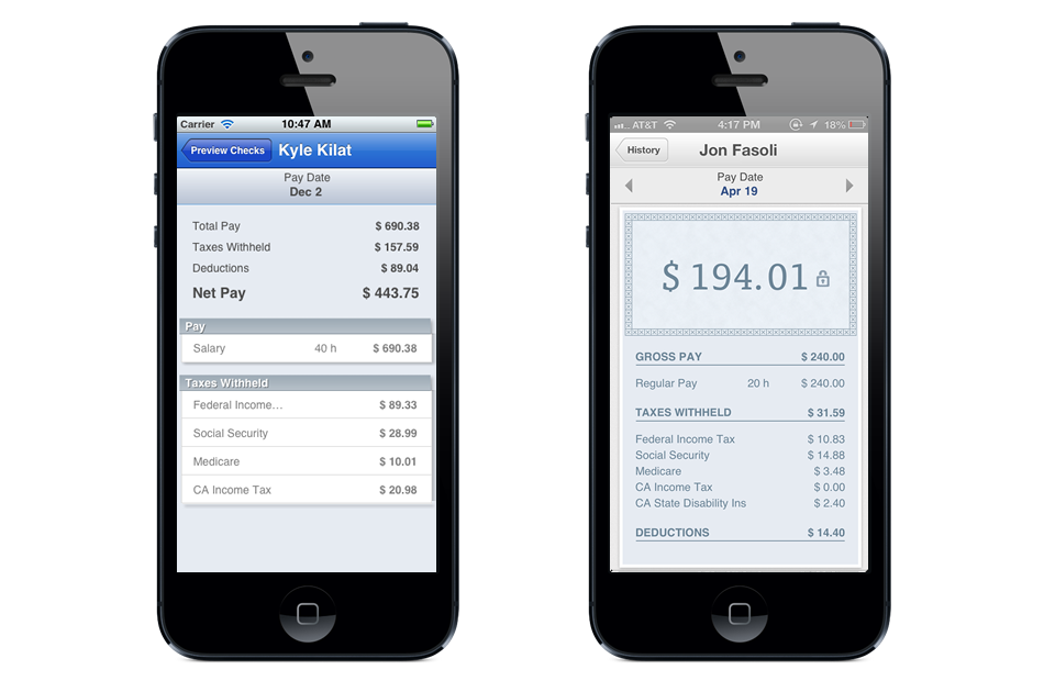
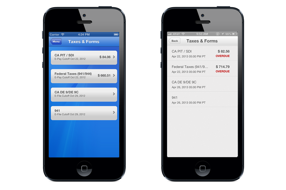
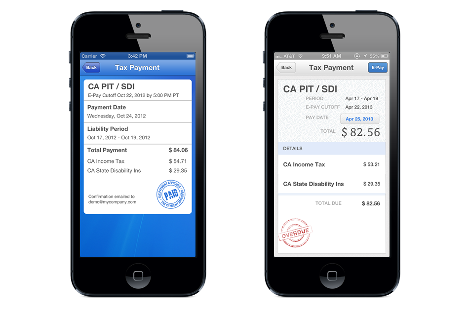
BEFORE AND AFTER
Here you can see screen-by-screen how the design refresh turned out. We muted the bright background in favor of bringing the content forward and used tangible metaphors (like the time card and paycheck) to bring the app to life.
RELEASE EMAIL
As part of the go-to-market plan, we emailed our customer based announcing the new iPad app and the updated designs. We also tested using photos of the team to see if we could drive an emotional connection and ultimately more downloads of the app.
