Unlocking Emotion
by Kylie Tuosto


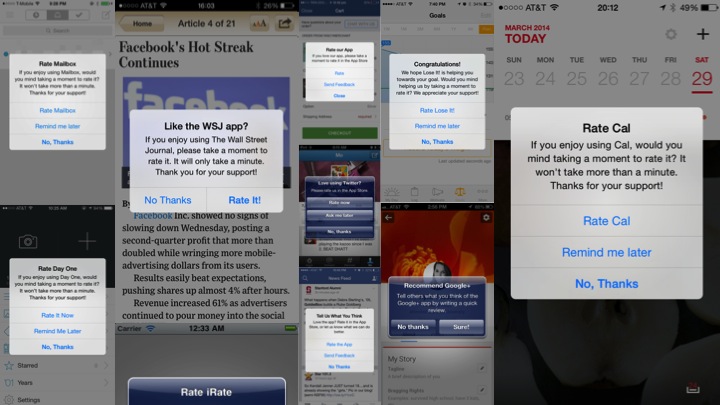







In July, I gave a talk at UX Night, an event put on by Cascade SF and hosted by Intuit. UX designers and enthusiasts from the bay area came to the Intuit campus for coaching sessions and two UX talks. It was a great opportunity to network with and learn from other designers.
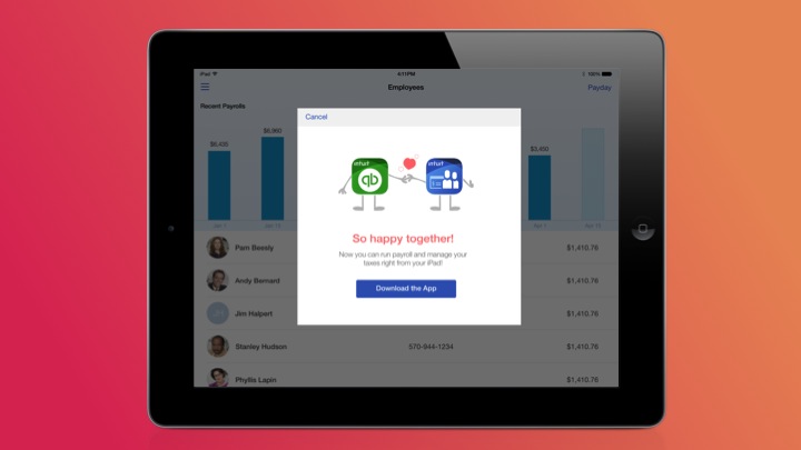
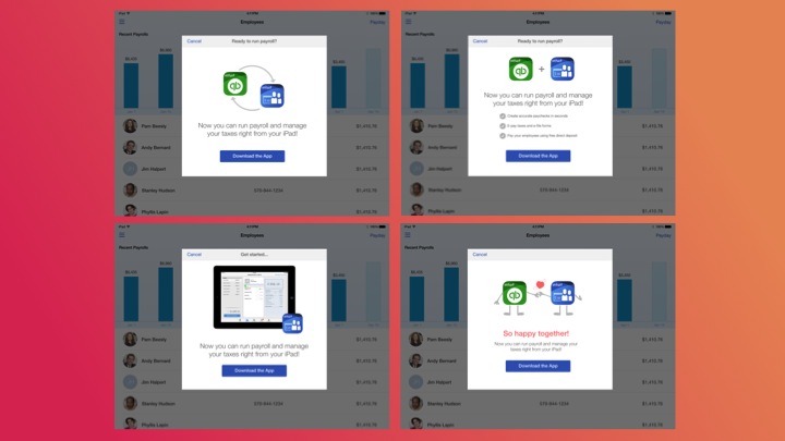
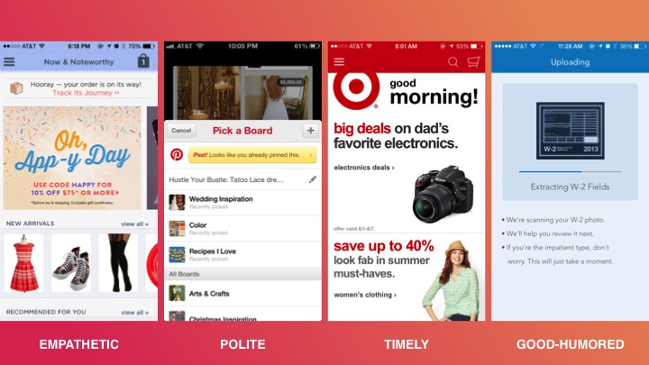
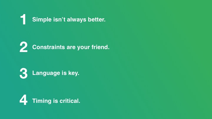
In my talk, Unlocking Emotion, I add to Aaron Walter's work on Designing for Emotion, by providing examples of how we've applied emotional design to our process at Intuit. Through three examples of design projects and experiments, I show how thinking about our relationship with customers in a more human way lead to measurable business outcomes. And ultimately, I distill our learnings down into four key takeaways for incorporating designing for emotion into your own design process.
1. Simple isn't always better.
The age-old UX rule of simple being better doesn't necessarily apply when you're trying to build a relationship with your user. In fact, it can often take more steps to tell a good story, build a relationship, or demonstrate your app's personality.
2. Constraints are your friend.
Designers typically relish the opportunity to design without constraints. But when designing to build an emotional connection, it's important to find a common experience that can bridge the gap between you and your user. Consider leveraging time of day, an upcoming holiday season, or another theme as a constraint for your next brainstorm to get the creative juices flowing.
3. Language is key.
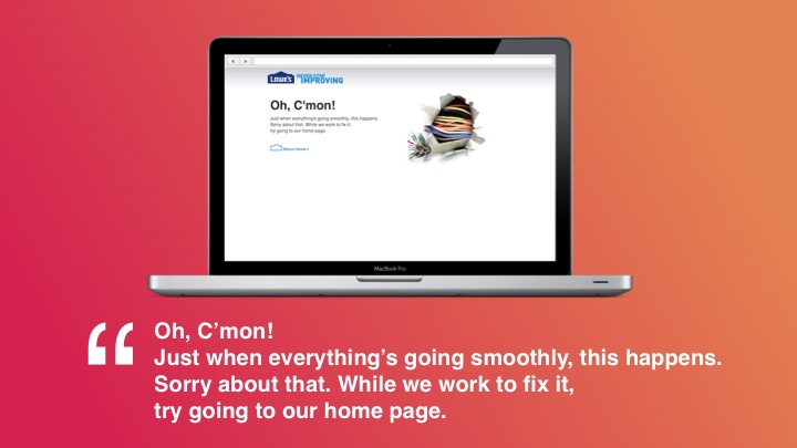
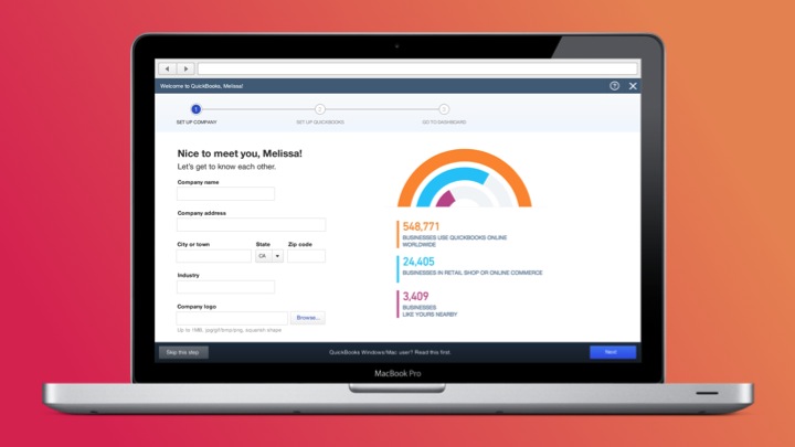
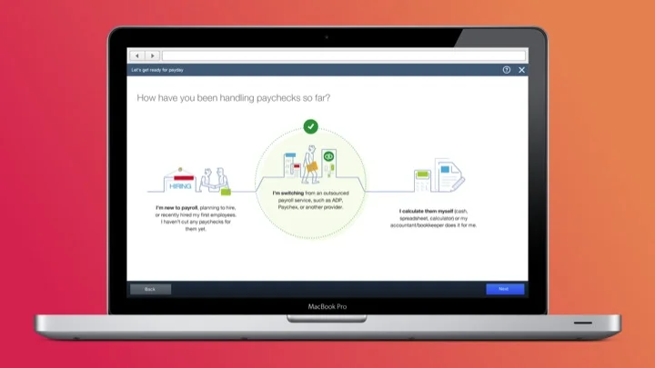
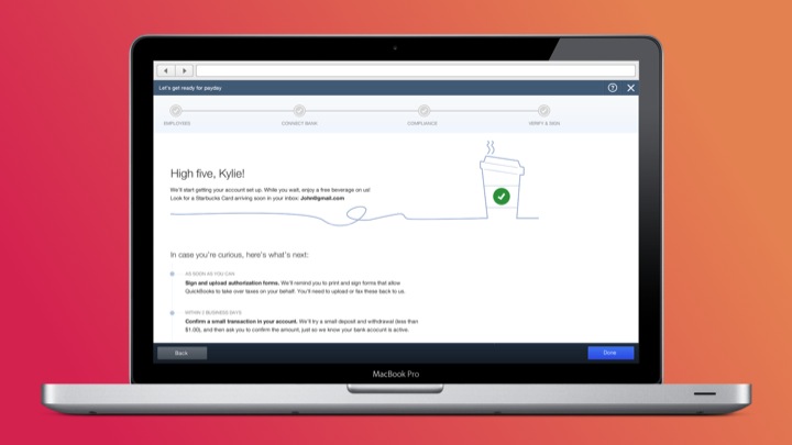
Language is our primary means of communication and without it, it's impossible to build a relationship with our users. Content design can make the difference between boring copy and a meaningful connection with the user. So it's important to go the extra mile when it comes to design iterations for content.
4. Timing is critical.
Human's have the unique ability to take inputs like time, emotions, and context into consideration when reacting to realtime conversation. When it comes to a user interface, however, we have to work extra hard up front to make sure that our interface doesn't violate these rules of interaction. Keeping timing in mind can save your app from feeling robotic!
In Designing for Emotion, Aaron Walter helps teams and companies think about building their application's personality as a way of connecting with their users on an emotional level. But building a personality at a big company isn't always easy. Individual work teams should feel empowered to experiment with personality in small experiences, measure the results, and scale success across the organization.
Here are links to the resources that inspired this talk:
- Aaron Walter - Designing for Emotion
- Stephen Anderson - Seductive Interaction Design
- Don Norman - Emotional Design
- Dan Saffer - Microinteractions


